Tools
Support
Pangolin Family of websites
Pangolin Laser Systems, Inc.
Kvant Lasers
Unity Lasers
ScannerMAX
Lasorb
Tools
Support
Pangolin Family of websites
Pangolin Laser Systems, Inc.
Kvant Lasers
Unity Lasers
ScannerMAX
Lasorb
The BEYOND Universe window was created with one main goal in mind - to give YOU (the client) complete control over how this portion of the user interface looks and functions. With the BEYOND Universe window, you have the ability to customize the user interface, the ability to create new effects, and the ability to extend BEYOND’s calculation path, opening a whole new world of functionality.
The first part of the BEYOND Universe window to understand, is Preview. BEYOND already has a Preview panel, docked in the top, upper right hand corner of main window. This preview panel offers a few fixed options (such as united preview), similar to the LD2000 platform and split view modes - 2×2, 3×3 and 4×4. The order and position of projection zones in split mode is not controllable. With the BEYOND Universe window, our intention was to unlock such features (such as Preview for example) allowing you to customize and configure the look, feel and functionality of the software, in a means that you prefer.
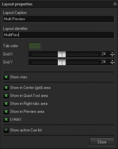
The second part of the Universe window to understand, is Layout. The Layout is the place where you will add your customized elements to the User Interface. The Universe window contains a number of Layouts. An easy way of thinking about this, is to imagine this as a “page” or “tab” where you can create customized elements. An important thing to know when creating a Layout, is that you must specify the Name and Caption for each Layout you make, just as pages and tabs are identified within BEYOND. The Name is an identifier of Layout objects, and is primarily used for PangoScripting. The Caption is what we see in the Tabs of Universe window, it is a text identifier.
The Component (or object) is what you put into a Layout. For example, it could be a Projection zone preview, a button, slider, effect or even a PangoScript… In any case, a Component is a tool in the Universe that will do some function defined by you. There are variety of components made for different purposes.
To summarize, there are three parts to the BEYOND Universe window that you should understand:
Preview - The BEYOND Universe, at it’s core, is an advanced and customizable preview window.
Layout - A Layout is a place where you add customized elements to the user interface.
Component - A component is a customized item, that you put into the Universe for control.
There are six types of windows available:
Projection Zone Component - This component displays the current output of a specified projection zone. The same applies in split-view mode. Just click on a projection zone and select it, just as you would in the Preview panel. In general, the functionality of this should be the same as the main Preview panel. Projection zones can be specified by Name, via the Index. BEYOND uses the Name, as the main way to identify a projection zone. The index is an additional method. You can use the slider linked to the index of a zone, and scroll/change the zone that will be displayed using this component. In addition, the Preview panel (NxN) use an index as well, and if you will want to make something equal to this, then you should use the Index.
The projection zone component is important for Spatial effects. More details about this are provided below.
Projector component - This component was made for visualization purposes only. It works together with the Projection Zone component, but only for Zones that are marked “Display as Beams” in the projection zones dialog. So, you need to put the Projection Zone component for your beam oriented zone, and then add Projector components, and you will see the new beam style preview.
Video preview - BEYOND can capture the video frames from the Timeline’s media files. Such frames (or bitmaps) can be used for Video to Laser effects, when the video data is used for processing of the laser frame. For example, when video masks the laser, or recolors the laser. The video frame has a reduced size that is enough for effects or a preview in the Universe window. This component is not a replacement of the Video window, which uses highly optimized video processing.
Webcam preview - BEYOND can capture video frames that come from the WebCamera interface. The frame can be used for realtime video tracing or for a Cue background picture. You can use the Webcam preview component for monitoring the video stream of a web camera.
MultiSelect component - This is very simple by nature. It allows you to select a number of Zones by clicking the Component base from the Button component. It is also possible to use PangoScript and get the same functionality. Pay attention that the order of Names in the list are the same as the order of clicks.
There are a variety of components from “Preview and Selection” that allow you to make a step, to a classic user interface design, with buttons, sliders and text. These components do not have any special or specific use as it relates to BEYOND functionality. It is simply a standard part of the user interface design.
Button Component - The button component can initiate actions defined from a PangoScript. The Button has an option that defines its style, as a Toggle or Push button. The Toggle button has two states - on and off, like a switch. The Push button is “on” while you keep it pressed. After that it returns to it’s default state (off). The purpose of the Push button is for the execution of a PangoScript.
Slider component - The slider component allows you to control a value, variable, parameter or component. For example:
Wheel component and XY Pad component - The Wheel component is just like a Slider, the only difference is it’s visual representation. The XY Pad does not offer anything specific, except for the ability to control a second axis. All settings and rules are equal to the Slide component.
Label component - This component allows you to place text within the Layout. This component is passive and used mostly for the visual design of the layout.
Image component - This component allows you to place a raster picture within the Layout. Once again, the component is passive and used mostly for the visual design of the layout.
A master effect is the result of the Button and Slider components, but it also introduces new types of construction possibilities within BEYOND. Normally, the effect is owned by the Cue or Image, such as Shape, or inside of an Event on the timeline, or in the FX grid. In this case, the effect is owned by the visual component. It means that the Universe window can be thought of as new type of effect container. Effects are placed after the Master Live Control, and applied to all cues. It also can be thought of as an extension of Master Live Control. Live Control is a standard object that works in Cues, Zones, ProTracks and Master. The structure is fixed. If you will add such a slider or button in the Universe window, then it will add more control after the Master Live Control.
Effect Button - Works in both Toggle and Push mode. In Toggle mode, effect can be turned on and off. In Push mode - it will only work while you hold the button down, just like Flash mode.
Effect Slider - Controls the action of an effect. Technically, it work as a morph between the frame before and after the effect. The minimum state of the slider means no effect, the maximum means a fully functional effect.
To explain these effects, we will begin with an example. Imagine a stone… You drop this into water, and see a wave “effect” created. This “wave effect” was the result of the “dropping the stone” and this general idea is the foundation of what we are calling a “drop effect”. In the context of BEYOND, you take an Effect, and “drop” it into a Zone, Cue, Master or PRO Track. You can control the duration of that Effect, and the Effect itself can be anything you want, depending on your needs.
The drop effect is based off of the Effect Button. At first, this button is in Push mode. As soon as you push the button, the effect will start to work. Second, the component (also a button) contains an effect inside of itself. This is not inside the workspace, and not inside the FX grid.
The Drop effect can be applied to any object, that uses Live Control objects. For example, the Projection Zone. When you drop an effect into a Zone, the Zone Live Control makes a record. Live Control memorizes each drop and will apply that corresponding effect at the time the calculation will occur. It is possible to do multiple drops of the same effect, one over another, and both will work. It is also possible to make drops of different effects, or effects with different durations - BEYOND will take care of all the “small” details, leaving you free to enjoy this feature.
Spatial effects use the position of the Projection zone component, within the Layout. The best way to explain this concept is with an example.
Imagine we have 10 projectors arranged in a line. And we want create a wave motion, so the far left projector goes up, after that the second, third, and so on. The Effects in BEYOND can easily do such things, but you will need to define a sequence of zones and then delays between them.
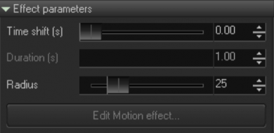
When making a Spatial effect like this, you need to place 10 Projection zone components in a line. Their order in the line will define the direction of the wave. After that, we need a to define additional elements like “effect position”. The distance between the Effect position in the Layout, and the Projection zone position, define an Action level. If effect is in the same position as the Zone, then we have 100% of the action. If an effect goes away, then the Action will decrease. After the maximum distance, the effect will have no action at all. The maximum distance is also called the radius of action.
So we have an Effect that has position, radius of action, and some number of projection zones. As soon as this Effect will know how to change the position over the time, we can create a wave effect, or some other variation of this.
The main difference between this method and others, is that with this method, the number of zones you have under the path of the effect is not important. You can add or remove the zones, and the effect will act the same.
Spatial Live Effect - This type of spatial effect is designed for live mode, because it does not offer any method for the animation of the effect’s position. The component is based on Button component, but you can move it in realtime. Button can be in Toggle or Push mode and the state of button is defined as active or not.
Motion based Spatial effect - Motion based effects offer a special way of moving an Effect’s position. You need to define the Position effect that will move it across the Layout. That is why this component offers two types of effects - one that defines action and a second for position. Component can also be based off of a Button component. The state of the button defines if it is an active effect or not.
“Gun” effect - Here we have a mix of Spatial and Drop effects. The name of the effect (“gun effect”) defines it’s idea. From the effect center, we send a “bullet” into each selected Projection Zone. The speed of the bullet is equal across each zone it will hit. The bigger the distance, the longer the amount of time before the effect is triggered. When the bullet hits the projection zone, it activates the effect, and the effect continues based off of the defined time, and then stops. Effects execute themselves once (one bullet, one effect). The key thing here, is that there is a time shift based upon the distance between the Effect and the Zone position.
Space-Time effect - The distance between the Effect position and Projection Zone position define a shift by time of Effect execution. This is a way to create a time shift effect where the value of the shift is defined by the distance between Effect position, and Zone position.
Each component has properties. Properties such as Position are common for all components of the Universe. Some properties are more specific and are for an exact type of component.
Object name - Identifier of the component. It is used in PangoScript and must follow the rules for identifiers.
Enabled - Component’s react to the mouse. When the component is disabled, it ignores clicks.
Visible - Means the Component is visible in the layout.
Ignore blackout - The Blackout is also known as a “global reset”. For components, Blackout will reset to default values. Use this option if you want that component to ignore the Blackout button.
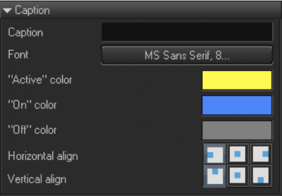
Caption - A text that appears in the component, and that applies to a button, slider or pad. This is just a visual element, and should not follow the rules of an Object name.
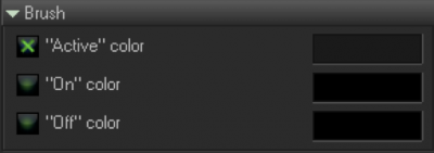
Brush Panel - Defines the color of the component’s body.
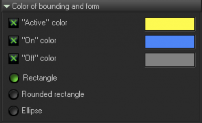
Active Color - Color of the component’s bounding rectangle, when the component is pressed. This is optional.
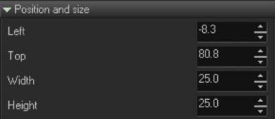
Position and Size - Controls the controls, that define size and position.
Slider

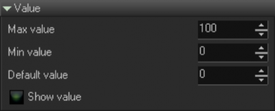
Value
Button - Toggle mode. By default, the Button goes down or into an “on” state, when the mouse is all the way down, and Up into an “off” state, when the mouse is released. Toggle mode means that the button will stay in an “on” state, after the first click, and then go to an “off” state, after the second click.
Group Index - Allows you to group the buttons. Only one button in the group can be in an “on” state, so, the Group index makes the most sense to use with the button in Toggle mode.

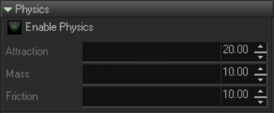
Physics - Physics is a standard option that is used during Live Control of an object, based on the “mass-spring” model. The smooths the coordinates of your mouse’s motion, when that component comes into play.
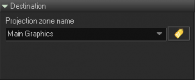
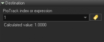
Destination - This panel defines components, such as what projection zone will be used. Depending on the component, the drop down list will show the list of zones, or allow you to use other object properties, or an expression (an expression is a mathematical formula, calculated by scripted work, on the level of the current layout. This is important to note, because it defines what variable can be used in a given expression).
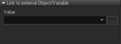
Link to external object/variable - One of the very interesting things in the BEYOND Universe, is that it allows you to use components, without the need for scripting. This is a “door” between the Objects system of BEYOND, and the Universe (user interface). As an example, you can put a Slider on a layout, and set a range of values from 50, to 300. After that, you can click on a button, and select Master BPM. In this case, Master is the name of an object, and BPM is it’s property. You will see that as soon as you change the BPM on the main toolbar, then the slider will also change it’s position. The opposite is also true - as soon as you change the slider’s position, it will also change the BPM.
OSC - The OSC tab is another important panel that adds functionality to the components of sliders, buttons and pads.
The first way of use this, is “internal”. The slider will generate OSC messages and send these into BEYOND’s core, the same way a message comes from TouchOSC through the network. This method allows you to use all the power of OSC servers, from within the Universe. All you need to know is the address of the BEYOND OSC Server. Components like Sliders or Buttons will supply one F argument.
The second way is “external”. BEYOND will generate OSC messages and act like an OSC Client… Do not forget to check your OSC Settings dialog, to ensure that OSC “Out” is enabled. Also, during the setup phase, we recommend that you use an OSC monitor, that wil show all messages generated by BEYOND.
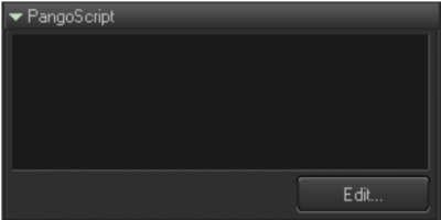
PangoScript - The PangoScript tab was designed for client’s who are well-versed with BEYOND, it’s features, and how the software works overall. PangoScript allows you to define a script that will be activated each time you click on a component. If a component has a script, than it has an internal “scripter” that executes it. This is similar to adding a script, into an existing PangoScript tab.
BEYOND has many places that work as “pools of scripters”. The first is the PangoScript tab (which is pretty obvious). The next, appear in various MIDI to PangoScript functions, and Keyboard to PangoScript tables, where each item may have it’s own scripter. So, the Universe is yet another result, of the system’s evolution.
For more information about scripting within the Universe, refer to the PangoScript guide.
Effect parameters
The Edit menu offers a standard set of commands – Copy, Cut, Paste, Delete, Select all, Unselect all, and Layout properties.
Show active Cue list - One of the Universe’s purposes, is to offer an improved version of the Preview panel. The Preview panel displays the list of currently playing (active) cues, and this is an important thing for “trackless tracks” mode. Option “Show active Cue list” displays the list of cues, the same as in the Preview panel.
